A key element of CPAC’s brand is the family of fonts used in our internal and external communications, including reports, staff presentations and brochures.
Primary typefaces
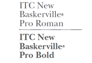
ITC New Baskerville Pro
- The ITC New Baskerville Pro family of fonts is the primary typeface we use for main titles/headers, quotes and callouts.
- Main headers should be scaled between 6-12pts larger than body text. A minimum of a 12pt leading gap should always appear after main headers.
- CPAC uses sentence case in all headlines and main titles. That is, we capitalize the first word of each title or heading only, as well as any proper names.
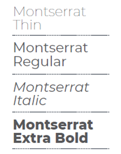
Montserrat
- The Montserrat family of fonts is used for subtitles/headers, body text, headers/footers, figure titles and infographics.
- Ideally, body text should be between 8-11pts in size with a leading of at least 3pts more than the selected size.
- Document headers and footers should be 3pts smaller than body text.
DM Sans
- DM Sans is the primary typeface we use for CPAC digital platforms, such as the website, social media and this design hub.
Examples
Refer to the examples illustrated below to add hierarchy to your messaging.
Main titles and headers
ITC New Baskerville®
Pro Roman
ITC New Baskerville®
Pro Bold
Subtitles/headers
Montserrat Thin
Montserrat Regular
Montserrat Italic
Montserrat Extra Bold
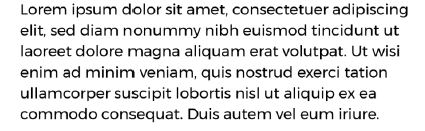
Body text
This is written in Montserrat. Lorem ipsum dolor sit amet, consectetuer adipiscing elit, sed diam nonummy nibh euismod tincidunt ut laoreet dolore magna aliquam erat volutpat. Ut wisi enim ad minim veniam, quis nostrud exerci tation ullamcorper suscipit lobortis nisl ut aliquip ex ea commodo consequat. Duis autem vel eum iriure.
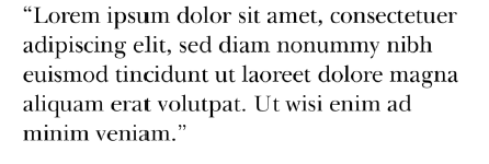
Callouts
“This is written in ITC New Baskerville. Lorem ipsum dolor sit amet, consectetuer adipiscing elit, sed diam nonummy nibh euismod tincidunt ut laoreet dolore magna aliquam erat volutpat.”