Our logo is based on the two strands of the DNA double helix that are the source of life and the basis for the science that helps us understand cancer. The circle at the top of the helix transforms a purely scientific symbol into a human symbol representing our focus on improving the cancer experience for all people in Canada.
Our logo should never be cut or altered in any way. Use of our logo must be approved by the Manager, Strategic Communications.
Core logos
CPAC’s core logo consists of two colours – blue and orange. We use a few variations of this logo depending on the audience and the primary language of the product.
- In most cases, we use a bilingual logo to communicate with a pan-Canadian audience and/or a federal government audience.
- Use the bilingual logo that leads with the primary language for the audience.
- The English only or French only logos are only used when the event or product is being delivered in both languages separately (e.g., printing an English only version and a French only version).
BILINGUAL ENGLISH FIRST
BILINGUAL FRENCH FIRST
ENGLISH ONLY
FRENCH ONLY
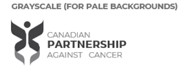
Other colour schemes
In cases where it is not possible to use the blue and orange logo (e.g., not enough contrast), you may use the grayscale or white colour scheme shown below.
GRAYSCALE (FOR PALE BACKGROUND)

WHITE (FOR DARK BACKGROUND)
Logo placement
All products created by CPAC should contain a version of our logo. For print reports, the logo should appear on the front and back cover.
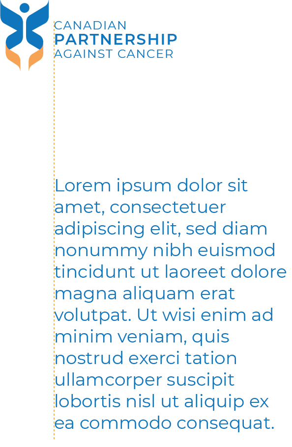
Alignment
When using our logo to create alignment, always attempt to align to the left of the text in the logo as shown. This effectively creates a clean and distinct look for our communications and helps our logo to stand out.
Protected space and scaling
In order to ensure maximum visual impact, the logo should be surrounded by a “protected space” that is free of any other graphic, photographic or typographic elements.
- The minimum size of the protected space should be 50% of the symbol height, as illustrated here. Whenever possible, it is preferable to have more than the minimum space around the logo.
- The logo should always be at least 1/2” away from the document edge (could be reduced to accommodate responsive design).
- To ensure legibility on screen and in print, the logo symbol should never be scaled to less than 3/8” in height. The ideal size is 1/2” in height. Scaling should always be done proportionally.
PROTECTED SPACE
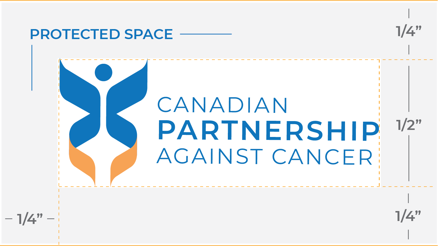
Protected space = 0.5” x 50% = 0.25”
(Not shown to scale)
MINIMUM LOGO HEIGHT